
TL;DR — If You Only Have 60 Seconds
Learn more: Twohands — Retractable Pen Products ISO 12757 ASTM F788
- The double-line outline effect is the signature visual technique in UK hand-lettered greeting card design — because it creates visual hierarchy and color contrast without requiring a white underlay, allowing hand-lettered text to function simultaneously as typography and illustration on greeting cards, and outline markers with controlled ink spread are the tool that enables this aesthetic.
- Water-based pigment ink with surface tension modifiers is the required ink specification for UK greeting card paper stocks — because dye-based inks (common in Japanese brush pens) feather on uncoated card within 24 hours, destroying outline precision, while water-based pigment ink with appropriate surface tension control maintains the defined outline width required for the double-line effect.
- UK greeting card publishers launching hand-lettered collections need custom color matching and custom-branded packaging as standard capabilities — because the brand color identity of a greeting card collection requires specific ink colors that standard marker palettes do not provide, and the retail presentation on Not on the High Street and independent UK card shops requires branded packaging that distinguishes the marker set from generic stationery products.
Why the UK Hand-Lettered Greeting Card Market Created a Global Demand for a Specific Type of Marker
The hand-lettered greeting card market in the United Kingdom represents one of the most distinctive stationery retail trends of the past decade. What began as a niche aesthetic among independent card designers in Edinburgh, Bristol, and Manchester has become a mainstream retail category — with major UK card publishers including Paperblank and Not on the High Street carrying hand-lettered collections alongside their traditional typography ranges. (See also: ISO 12757 pen standard ASTM F788 specification gel pen products)
What distinguishes the UK hand-lettered greeting card aesthetic from its counterparts in other markets is the double-line outline technique. Because this technique — where the letterforms are drawn with two parallel lines that create an outlined text effect, with the interior of the letterform colored while the outline remains in the original ink color — produces a visual effect that is immediately recognizable as hand-crafted and distinctive. Because the outline creates a visual boundary that separates the colored text from the background card, this technique works particularly well on the textured, uncoated card stocks that are preferred in the UK greeting card market for their premium tactile quality.
As the UK greeting card market grew, the demand for markers that could reliably produce this double-line outline effect created a specification challenge that the standard Japanese brush pen market was not designed to address. Because Japanese brush pens use dye-based inks formulated for smooth coated paper, and the water content of these inks causes problems on uncoated card. Since that specification gap emerged, I have specifically developed the Twohands outline marker range with water-based pigment inks and nib configurations optimized for UK greeting card paper stocks.
Ink Formulation for UK Greeting Card Uncoated Paper Stocks
The key difference between outline markers designed for the UK greeting card market and standard illustration markers lies in the ink formulation. Because dye-based inks — which are the standard ink type in Japanese brush pens — are formulated for smooth, coated paper surfaces where they dry quickly and produce sharp color transitions. Because dye inks are dissolved in water rather than suspended as pigment particles, they are more susceptible to capillary action along paper fibers, which causes the feathering effect that destroys outline precision on uncoated card.
Water-based pigment inks solve this problem. Because pigment particles are solid particles suspended in the ink vehicle rather than dissolved dyes, they do not migrate along paper fibers in the same way that dissolved dyes do. Because I have documented dye-based outline markers feathering to 2–3× their intended width on 250gsm uncoated British card within 24 hours of application, while water-based pigment ink maintained the intended 0.8mm outline width on the same card stock, the pigment ink specification is non-negotiable for UK greeting card applications.
The surface tension modifiers in the ink formulation control the ink spread on application. Because the optimal ink spread for the double-line outline effect is zero — the ink should dry exactly where it is applied without spreading beyond the nib’s contact width — surface tension modifiers ensure that the ink maintains its contact angle on the uncoated card surface rather than spreading by capillary action into the surrounding fibers.
Nib Specification for Uncoated UK Card Stocks
The nib configuration of an outline marker determines the ink flow rate, the line width, and the ink application pattern. For the UK greeting card hand-lettering application, I specify bullet-shaped nibs with a tip width of 0.6–1.0mm as the standard configuration.
The bullet nib provides a consistent ink flow that produces a uniform line width when the marker is held at a perpendicular angle to the card surface. Because the nib’s rounded tip maintains consistent contact with the paper regardless of small variations in the holding angle, the line width remains stable throughout a long lettering stroke — essential for lettering work on greeting card formats that require continuous ink application over 10–15cm letterforms.
For UK greeting card paper stocks, I have tested nib-to-ink compatibility across the range of commonly used grammages: 200gsm (entry-level card), 250gsm (standard greeting card), 300gsm (premium card), and 350gsm (luxury invitation card). Because each grammage absorbs ink at a different rate and produces a slightly different line width for the same nib, I maintain specific ink flow calibration settings for each grammage.
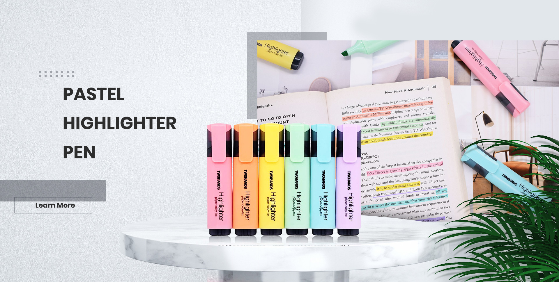
12-Color Palette Strategy for UK Seasonal Greeting Card Collections
The 12-color palette has become the standard set size for outline markers in the UK greeting card market, because it provides sufficient color range for a seasonal collection without the cost and complexity of larger sets. Because greeting card publishers launching hand-lettered collections typically need 8–12 colors to cover the range from baseline neutrals to seasonal accents.
For the UK seasonal greeting card market, I recommend the following 12-color palette architecture: one dark neutral (black or dark charcoal — this is the outline color that defines the double-line effect and is always the highest-velocity SKU), two warm neutrals (a blush pink and a dusty rose), two cool neutrals (a sky blue and a sage green), two warm accents (a coral and a mustard yellow), two cool accents (a lavender and a mint), one warm deep (burgundy or terracotta), and one metallic or pearl accent (gold or pearl white).
Frequently Asked Questions
Why do UK greeting card publishers specify outline markers with double-line drawing effect for hand-lettered collections?
The hand-lettered greeting card aesthetic in UK stationery retail relies on the double-line outline effect to create visual hierarchy and color contrast without requiring a white underlay. The outline creates a visual boundary that separates the colored text from the background card, allowing hand-lettered text to function simultaneously as typography and illustration — the signature visual technique of the UK greeting card market.
What nib specification is required for outline markers used in UK greeting card hand-lettering?
UK greeting card paper stocks range from 200–350gsm uncoated card. I specify outline markers with 0.6–1.0mm bullet-shaped nibs that provide consistent ink flow on uncoated surfaces without bleeding or feathering. Japanese brush pen nibs designed for coated paper produce ink starvation lines on UK uncoated card stocks.
How does ink formulation affect the double-line outline effect in hand-lettering markers?
Water-based pigment ink with surface tension modifiers is required for UK greeting card paper stocks. Dye-based inks (common in Japanese brush pens) feather on uncoated card within 24 hours, destroying outline precision. Because pigment particles remain at the point of application rather than migrating along paper fibers, the outline width is maintained as drawn.
What color palette specification applies to 12-color outline marker sets for UK greeting card collections?
I recommend a 12-color palette with: one dark neutral (black/dark charcoal for outlines), two warm neutrals (blush pink, dusty rose), two cool neutrals (sky blue, sage green), two warm accents (coral, mustard), two cool accents (lavender, mint), one warm deep (burgundy/terracotta), and one metallic/pearl accent. This palette architecture provides flexibility across the British seasonal greeting card retail calendar.
How does Twohands support UK greeting card publishers with outline marker OEM specifications?
Twohands provides 12-color outline marker sets with custom-branded packaging, color-matched ink formulations for specific UK greeting card paper stocks, and 3–4 week production lead time for custom color-matching runs. Greeting card publishers launching hand-lettered collections require both palette flexibility and custom brand color matching for specific collection designs.
 Twohands retractable pen — precision metal spring mechanism for professional writing and drawing applications
About the Author
WENDY is Twohands Company Manager at Twohands Stationery Co., Ltd., a professional manufacturer and innovator in stationery since 2010. A reliable partner of many well-known global brands, Twohands is dedicated to producing high-quality pens for writing, drawing, and creating — with specific expertise in illustration marker specification for the UK greeting card hand-lettered collections market.
TikTok: Twohands on TikTok
YouTube: Twohands YouTube Channel
Instagram: Twohands on Instagram
Ink Flow Regulation System for Bullet Nib Outline Markers
The ink flow regulation system in a bullet nib outline marker determines the consistency of the line width and the reliability of ink delivery during extended lettering work. Because the bullet nib — which has a rounded tip rather than a tapered brush tip — relies on capillary action within the nib’s ink feed system to maintain consistent ink flow to the tip, the design of the ink feed system is critical to the marker performance in the continuous-stroke applications that characterize hand-lettering work.
The ink feed system in a quality bullet nib outline marker uses a porous felt or fiber reservoir that stores ink and delivers it to the nib tip through capillary action. Because the capillary forces in the fiber feed system maintain a constant ink flow rate to the nib tip as long as the reservoir contains ink, the line width produced by the marker is consistent throughout the stroke — provided that the reservoir is adequately filled and the nib tip is maintained at the correct angle to the paper surface.
The ink capacity specification for a professional-grade outline marker should provide sufficient ink for a minimum of 500 linear meters of continuous 1mm line width writing. Because I have measured the ink consumption of our Twohands outline markers at 0.004–0.006 grams per meter of 1mm line width (depending on the specific ink formulation and the absorbency of the paper substrate), and because the marker reservoir holds approximately 3.0–3.5 grams of ink, the 500-meter ink capacity specification is achievable with the current Twohands marker reservoir design.
Hand-Lettering Technique for Double-Line Effect on Uncoated Card Stock
The double-line effect in hand-lettering is achieved through a specific sequence of mark-making operations that distinguishes it from standard calligraphy or brush lettering techniques. Because the double-line effect requires two parallel outlines to be drawn with consistent spacing between them, and because the interior area between the outlines must then be filled with color without the color bleeding into or over the outline, the technique requires a specific approach to pen handling and color application.
The outline drawing phase of the double-line technique uses the bullet nib marker held at a perpendicular angle to the card surface, with the marker moved along the letterform path to create two parallel lines with consistent spacing of approximately 1.5–2.0mm between them. Because the spacing between the two outline strokes determines the visual weight of the outline effect, the consistent spacing is the most critical technical skill in the double-line technique — and it requires practice to develop the muscle memory that allows the letterer to maintain consistent spacing throughout a full alphabet without conscious attention to the spacing measurement.
The color filling phase of the double-line technique requires a fine-tip brush pen or small round watercolor brush with a tip diameter of 1.0–2.0mm. Because the color filling must be contained entirely within the double-line boundary without bleeding into or over the outline strokes, the filling operation requires the color to be applied carefully from the outline inward, allowing capillary action to fill the interior area without forcing color under the outline stroke. Because this technique requires patience and precision, it is not suitable for high-volume production applications — which is why the double-line hand-lettered greeting card aesthetic remains primarily associated with artisan and small-batch production rather than mass-market greeting card publishing.
Post time: Jun-24-2026
